Comedy Central Flips With New Logo
No joke: Comedy Central will soon sport a new logo and on-air look.
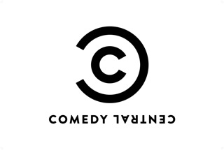
After years of employing a fairly busy urban graffiti style, the network will changing to a relatively clean look with a stark logo that features the letter "C" within an inverted "C." When the channel writes out its name, the work "Channel" will also be upside down.
"The Comedy Central brand is as strong as it's ever been and it was time to refresh the look," said Comedy Central Michele Ganeless.
The upside down typography represents an "irreverent wink," said Bob Salazar, senior vice president, brand creative director at Comedy Central. The new look fits with all type of comedy and with all audiences, on all platforms, he added.

The logo is also designed to work on new digital platforms and work in social media, where it will fit in nicely with the familiar logos of Facebook and Twitter. "The new clean image is ideal in small spaces, like in social media," Ganeless said.
The logo will begin to air on the network Jan. 1. It is being previewed on Comedy Central's Web site now and will be fully incorporated into the site on Jan. 11.
Read more at B&C here.
The smarter way to stay on top of the multichannel video marketplace. Sign up below.
Jon has been business editor of Broadcasting+Cable since 2010. He focuses on revenue-generating activities, including advertising and distribution, as well as executive intrigue and merger and acquisition activity. Just about any story is fair game, if a dollar sign can make its way into the article. Before B+C, Jon covered the industry for TVWeek, Cable World, Electronic Media, Advertising Age and The New York Post. A native New Yorker, Jon is hiding in plain sight in the suburbs of Chicago.

